Find busy MQTT topics with the graph
Spot a busy branch, expand its parents and follow the traffic down to a single topic. Learn how node size, heat and collapsed totals tell you where to look.
Before you start
Open a connected broker in MQTT Viewer and subscribe to the topics you want to explore. Let some messages arrive first. This example uses a local test broker with sample factory and office traffic at different message rates.
1. Watch the graph in action
Follow factory/line-1/press/temperature from a collapsed parent to its payload. This is a recording of MQTT Viewer receiving live MQTT messages from a sample publisher.
2. Open the live graph
In the received-topic panel, switch from List to Graph. The graph uses the topics this connection has received. It builds the hierarchy from the / levels in each topic name, with parents on the left and children to the right.
A message on factory/line-1/press/temperature creates the path through factory, line-1 and press. Those parents can exist even when no messages are published to their exact names.
Start with the branches collapsed and Busiest first selected. Click Fit graph to view if any nodes are off screen.
3. Read size, heat and branch totals
Size shows message rate. A larger circle means more messages per second, smoothed over time. It does not represent payload bytes or the number of child topics. Use the hover details to read the actual rate; the circles have a maximum size.
Heat shows recency. In the default palette, a newly received message makes a node hot. Its colour then cools towards the idle end of the legend. A small, hot node may have received a single recent message. A large node indicates sustained or recent heavy traffic.
The outline ring marks a collapsed aggregate. The +N badge counts the descendant topic nodes hidden beneath it, across all levels. It is not a message count or a count of immediate children.
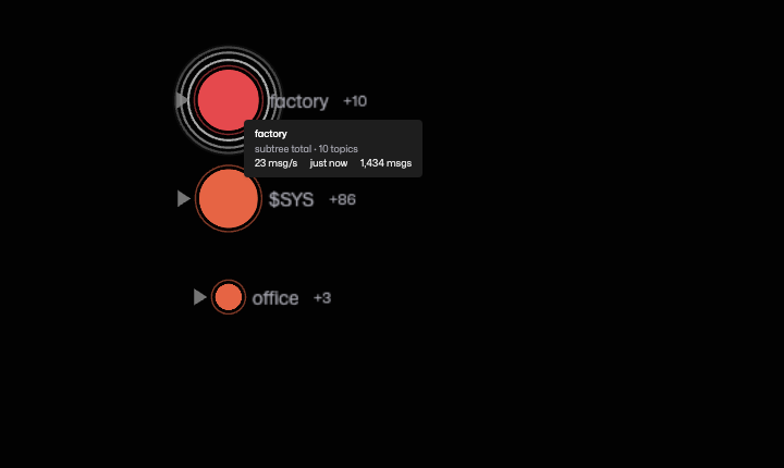
For example, if temperature sends 20 messages/s and vibration sends 2 messages/s, their collapsed parent press represents about 22 messages/s once the rate settles. A message from either child refreshes the parent's heat. If press also receives 1 message/s directly, its collapsed total is about 23 messages/s.
4. Follow a busy branch
Click the large collapsed factory circle. It expands and brings its children into view. Compare line-1 with line-2: the larger collapsed node points towards more traffic.
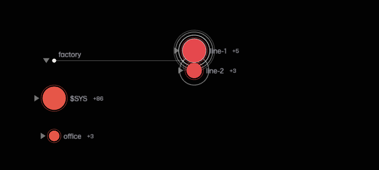
Click line-1, then the larger press node. Each expansion reveals another level, so you can walk the busy chain without opening the entire namespace.
An expanded parent shows only messages sent to that exact topic. A parent used only as a path becomes a small junction dot. A parent that also receives messages keeps a circle sized and coloured by its own traffic. The children's activity is visible on their separate nodes.
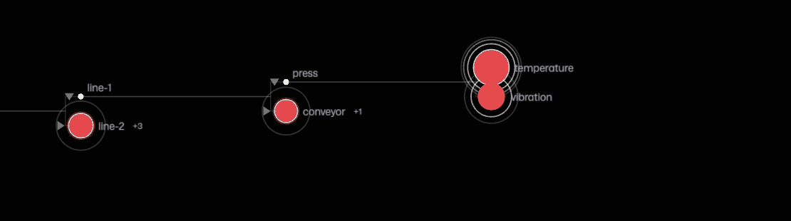
Use the small triangle beside a parent to collapse it again. Its circle returns to the combined branch rate and most recent activity. The traffic stays visible even when the children are hidden.
If a large parent shrinks when you expand it, the messages have not stopped. You have changed from reading the branch total to reading that parent's own traffic.
5. Inspect the source
Hover a node to see its full topic path, message rate, time since the last message and message count. The scope says subtree total for a collapsed branch and this topic only for an expanded parent.
Click a leaf such as temperature to open its topic panel. Inspect the payload, compare messages or chart a numeric value to work out what the publisher is sending. Clicking a collapsed parent first expands it; clicking an already expanded node selects its own topic.
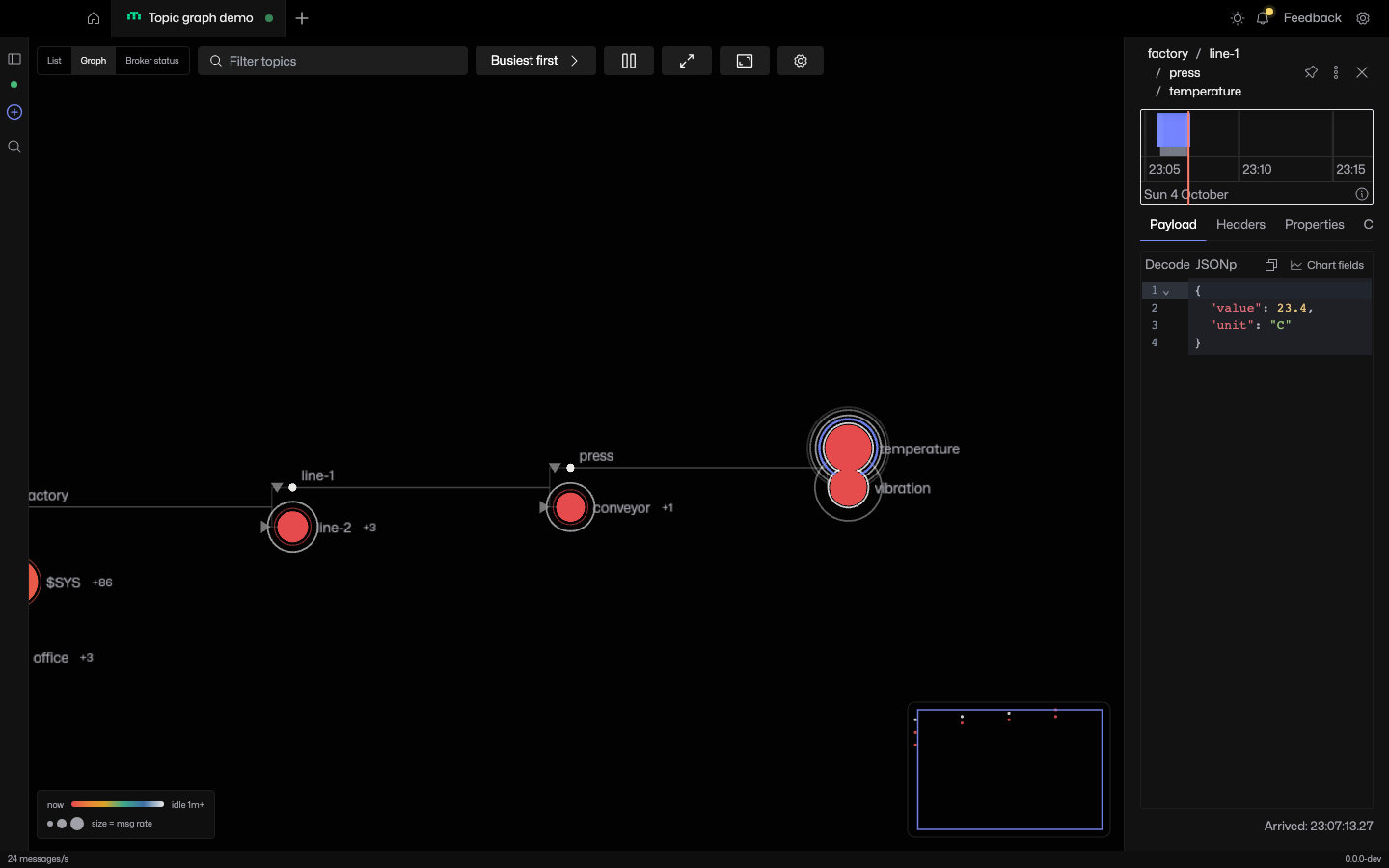
Right-click a node for topic actions, including copying its path and pinning it. Pin a topic you want to return to while exploring other branches.
6. Filter and navigate
Enter vibration in Filter topics to narrow the graph. Matching topics keep their ancestor paths so you can still see where they belong. Filtering changes the view, not the MQTT subscription. Clear the field to return to the other branches.
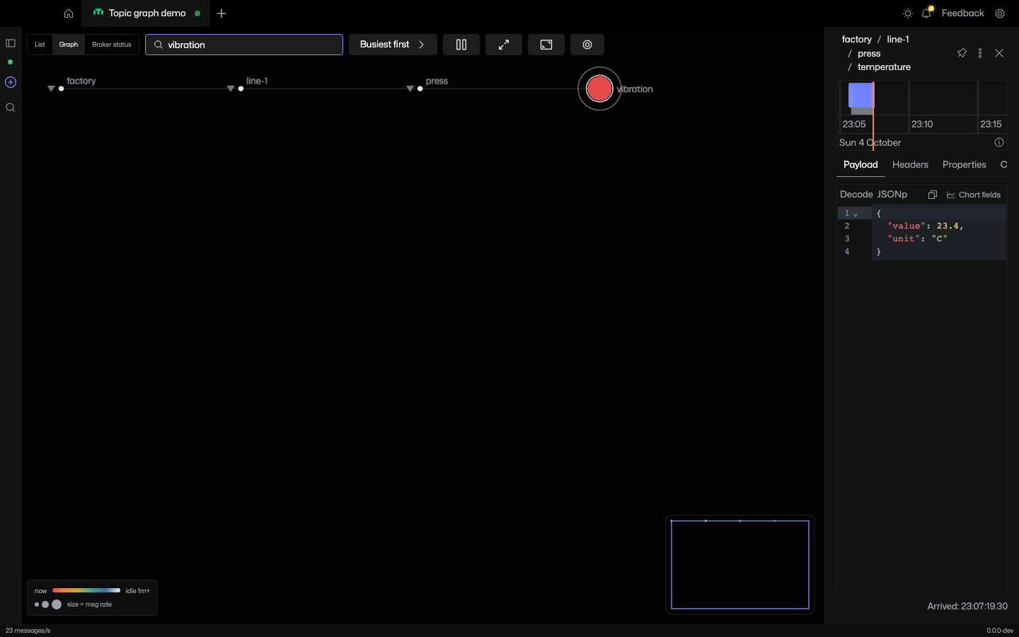
Drag the background to pan and scroll to zoom. Use the minimap to move around a larger graph, or Fit graph to view to recover the overview. Expand/Collapse all topics is useful for a small namespace; opening individual branches keeps a busy one easier to read.
Use Pause live re-sorting when changing rates keep moving sibling nodes. Incoming messages and the traffic display continue updating. Click Resume live re-sorting when you want the order to follow activity again.
7. Tune the graph for your traffic
Open the graph's settings menu to adjust how activity is displayed. These settings are saved per connection.
- Recency window
- Controls how long a node takes to cool to idle. Use a shorter window to distinguish frequent updates, or a longer one for sensors that publish minutes apart. This changes the colour display, not message retention.
- Rate smoothing
- A shorter interval reacts faster to a burst. A longer interval gives a steadier view of sustained traffic. The displayed rate may take time to settle after traffic starts or stops.
- Max node size
- Limits how large busy circles can grow. Hover to compare exact rates when several nodes reach that limit.
- Follow hottest topic
- Keeps the view following recent activity. Leave it off when you want to stay on a branch while investigating.
- Legend and colour-blind safe palette
- Keep the legend visible while learning the graph. Switch palettes if the default colours are hard to distinguish.
If the graph is empty or difficult to read
Clear Filter topics and click Fit graph to view. Check List to confirm messages have arrived and your subscriptions match the expected topics. The graph describes traffic received by this connection, not everything happening on the broker.
If every node looks hot, shorten the recency window and compare sizes and hover rates. If the graph is crowded, collapse branches and follow one path at a time. A cold node means no recent message within the chosen window; it does not prove the device is offline.